I am intrigued by the clumsy graphical translation in my paper today (NRC weekend, september 24th and 25th 2011, volume 303 Algemeen Handelsblad), about the dutch annual policy reflections in The Hague:
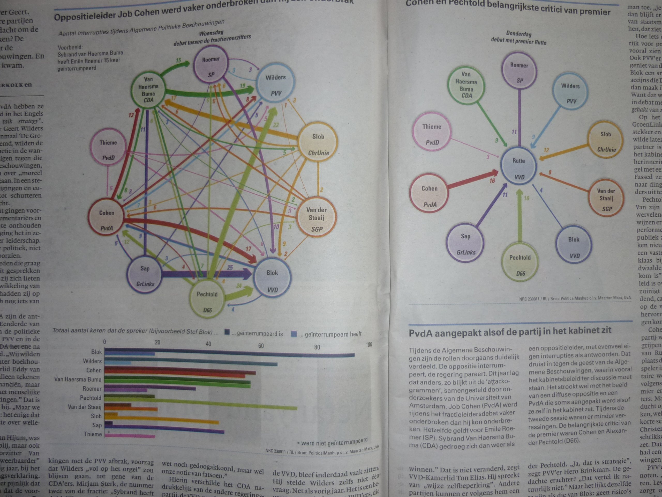
1) upper left: what a mess. Why not use a rosette system like this one?
2) upper right: why let these colors compete for attention with the small bandwidth of widths of the arrows?
3) lower left: why not write: ‘People who have opposite standpoints interrupt each other more often’?
Luckily there is a source: Political mashup: research about wordclouds and xml by the Amsterdam University. The paper and Political mashup collaborate and have a shared platform with conceptual graphics.
Btw, this original image shows better proportions of arrow widths.
Diging a little bit deeper we find an amusing and interesting student contribution to an impressive Open Data Challenge (2011):
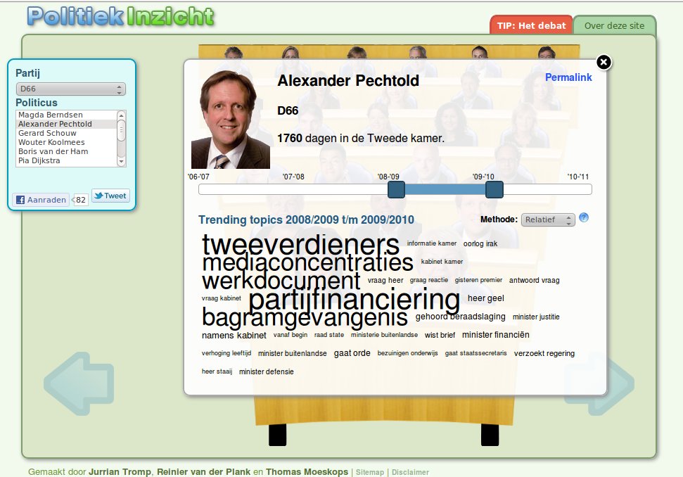
From there, through the red tab, we find the orignal funny and mature looking source of the clumsy translation by my newspaper:
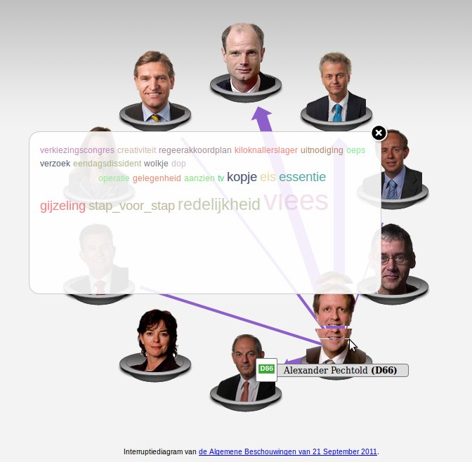
… I was a bit puzzling finding out how the color coding works, though. Very well done, Jurrian Tromp, Reinier van der Plank en Thomas Moeskops! They appear to have removed quite some distracting elements from one of their inspirations: http://www.congressspeaks.com. I hope Political Mashups and NRC keep learning and perhaps sponsoring students or providing internships! Perhaps this will one day lead to visual support of understanding political profiles and voting.